


1. In the bottom picture I increased the temperature to give the photo a warmer color. I moved the tint to the left to -19 to bring more green into the photo. I decreased the exposure to -.45 to reduce the harsh lighting and then I increased recovery to 98 to remove the clipping. As a final touch, I increased the clarity to +37 to sharpen the images.


2. I increased temperature to +21 and decreased tint to -2 to help remove the overall blue tint. I increased exposure to +30 to lighten the entire photo but then had to increase recovery to 100 to remove the clipping. I increased fill to 66 to bring in more light and offset the shadows by increasing the black to 3. I increased brightness to 55 and increased contrast to 65 to give more definition to the rocks. I increased the clarity to 53 to sharpen the edges of the rocks and leaves. I increased vibrance and saturation to increase the richness of the colors.


3. I increased temperature to +21 and decreased tint to -2 to help remove the overall blue tint. I increased exposure to +30 to lighten the entire photo but then had to increase recovery to 100 to remove the clipping. I increased fill to 66 to bring in more light and offset the shadows by increasing the black to 3. I increased brightness to 55 and increased contrast to 65 to give more definition to the rocks. I increased the clarity to 53 to sharpen the edges of the rocks and leaves. I increased vibrance and saturation to increase the richness of the colors.


4. I decreased exposure to -1.15 and increased recovery to 85. This took away much of the glare from the water. Then I increased fill light to 11 to put light back in the shaded areas. I increased brightness to +86 to lighten the photo. I increased contrast to +3 and decreased clarity to -16 to soften the image and increased vibrance to +39 to allow more color.


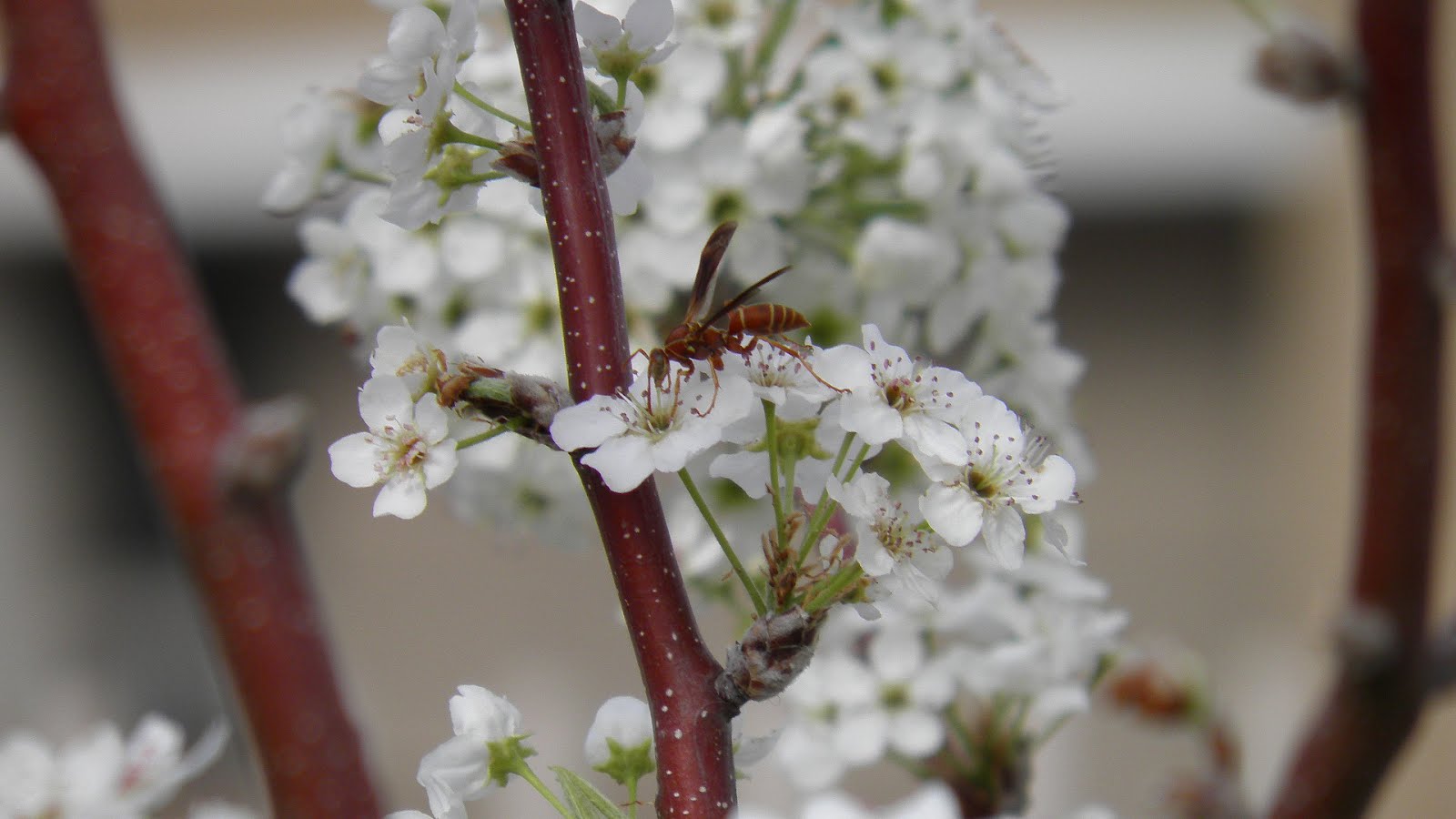
5. I increased the vibrance to +60 to give a richer color to the the trees.


6. I increased the temp to +13 to give the image a slight glow and I decreased the exposure to -2.15 and then increased the recovery to 100 to remove the highlight clipping. I increased the brightness to +38 to acquire the richness of the grass and the green in the trees. I decreased the contrast to -50 and increased the clarity to +28 for definition in the blades of grass. I decreased the vibrance to -11 so that the grass would not look brassy and I increased saturation so that the colors would be deeper.


7. I increased the temp to +13 to give the image a slight glow and I decreased the exposure to -1 and then increased the recovery to 100 to remove the highlight clipping. I increased the brightness to +38 to acquire the richness of the grass and the green in the trees. I decreased the contrast to -50 and increased the clarity to +28 for definition in the blades of grass. I decreased the vibrance to -11 so that the grass would not look brassy and I increased saturation so that the colors would be deeper.


8. I increased the temp to +23 to move away from the blue tint. I increased the exposure to +.85 and then increased the recovery to 26 to remove the highlight clipping. I increased the brightness to +33 to lighten the picture and increased the contrast to +31 to bring out the definition of the rocks. I increased the clarity to +43 to sharpen the edges of the rocks and allow more definition. I decreased the vibrance to -20 to compensate for the increase in brightness and contrast.


9. I decreased the temperature to -3 and the tint to -16. I increased the fill light to 17 to lighten shadows that hid the colors on the rocks and then increased black to 4 to keep the shadows. I increased the brightness to +59 and the contrast to +51 to bring out the colors on the rocks. I increased clarity and vibrance to +27 to provide more distinct color and definition. I decreased saturation to -8 to Keep the color in the rocks looking realistic.


10. I decreased the fill light to 80 to lighten the areas that were in the shadows of the rocks. I increased the contrast to +48 to give more definition to the colors on the rocks and I increased the clarity to +1 to sharpen the images.